Macrosoft being revamped

So I’ve decided to get a new theme for this blog. Name is staying the same as well as content.

I’ve wanted to blog so much, I have so many drafts, but I can never get around to fine tuning the posts before submitting them. So I’ve decided that I will take another shot at blogging again about things I love/hate about Microsoft from a consumer/student perspective, stuff I wish Microsoft would be more gutsy (and often time smarter) to do, and of course the occasional rant.

I might mess around with different themes until I find what I like.

I’m also changing the tagline. Originally, I started on Windows Live Spaces (if anyone remembers that) as MSFT and the Future, with an optimistic hope for Microsoft. Then it became Macrosoft when the inevitable migration to WordPress happened, with a more critical perspective of Microsoft and wanting to look at what I felt was “the bigger picture”.

Now I just want to focus on the bits of stuff I notice about Microsoft, my love/hate relationship with Microsoft and my wishlist and rants towards Microsoft. I used to get a fair amount of readers from Redmond, if the stats I used on an app with Windows Live Spaces is to be believed, and I’d love to see some people there check out my blog sometime to understand what I as a consumer and a university student feel when i see or deal with Microsoft software and services.

I loved blogging before, and I definitely want to go back to it. So I’m changing the tagline of this blog from “Exploring the bigger picture of Microsoft” to “The tales of a university student exploring the scope of Microsoft’s consumer products and services.” I didn’t want to bother migrating or dealing with changing the Macrosoft(er) name so I put “scope” to keep the name in check.

I want this blog to have a lighter tone, not have to worry about being serious, and truly share my thoughts as a user.

I’m still a major fan of Microsoft, but I’m not a fanatic. I will criticize Microsoft as much as I’d like, but I’ll also praise them on things I enjoy. As of September 2013, I think they’ve been making a lot of bad decisions in their attempts to gain  more consumer mindshare, but I believe as they keep refining and fixing what they do, they’ll reach a much better level of consumer interest.

Here’s to hoping that Microsoft continues to be better and always improving, and that I will blog more frequently, at least once a week. Thanks for reading!

Bing Maps fails with Downtown Houston location pinpointing

I use Bing Maps primarily. It’s partly because I’m still an MS fan at heart, but also because I have little interest in giving Google more info about me. However, Bing Maps is just plain terrible at location searching. Maybe not as bad as Apple Maps, but definitely far from what Google has.

Searching for “Downtown Houston” made me laugh today. I commented earlier to a post complaining about how slow transit was back in the time he was using it. I wanted to show him it’s not that bad today (thought not that great either), and looked up quick time info based on Bing Maps transit calculations. I didn’t notice at all that my quick search for “Downtown Houston”’ was terribly mistaken on Bing Maps before telling him it was only kind of better (not taking into account that it was actually nearly 50% better if downtown were correctly located.). Here’s an image to show you the problem:

image

For those that have never been to Downtown Houston, the Downtown area of Houston is contained within the loop of the freeways I-45 and Highway 59. However, Bing Maps believes Downtown Houston is somewhat more west of where it actually is along Buffalo Bayou Park. Houstonians would probably be laughing at Bing if they knew this. It’s really sad that Bing does not know where our actual Downtown is. It’s not very far off, but it’s not there either. I marked what I consider the center of Downtown Houston to be with the orange place marker with the 1 on it.

Google Maps has it right as usual.

image

Well it’s not what I’d consider the center or even bustling part of Downtown, but it is in Downtown. Why can’t Microsoft get this right? Who knows? I definitely reported it and repositioned it on feedback though.

Wishlist Revisited: Microsoft’s 10 redundant things

I’m going back through some of my old “wishlist” of items that I wish Microsoft would do (back then). Now I’m revisiting them and assessing the status of each wish. For this post, I’m referring to a post from August 11, 2009 on “10 ‘redundant’ things Microsoft could perhaps fix.”

I felt back in 2009 that there were a lot of redundant products that would have been better combined into one. I pointed out the redundancy, and pointed out the solution I thought would be most ideal. Here we go.

1. Microsoft Office v. Microsoft Works – I suggested the different branding was annoying and the lack of UI similarities (Works was like Office 2003 in UI). I suggested Office Web Apps as it’s true replacement, or finding discounts for Office, etc.

Result: When Office 2010 came, MS Works was replaced with Office Starter 2010 (ad-supported). It had Word Starter, Excel Starter, and PowerPoint Viewer all with obviously reduced functions. Only available directly to OEMs like Microsoft Works was, and got discontinued in June 2012. Office 2013 came, but did not offer “basic” desktop Office programs. Instead, Microsoft was hoping those users would either go with buying a Windows RT tablet that has the main Office apps all included with no restrictions (outside of pure desktop macros and such). Plus Office Web Apps have expanded their functionality very much since then and are great for those on the go.

Thoughts: I thought Office Starter was a good evolution to MS Works. At least Office Starter looked like Office 2010 at the same time, had a clearer associate to Office than “Works” did, and provided just the basic stuff. I’m OK with Office 2013 pushing for users who couldn’t afford the suite to either go for the 365 subscription model, buy a Windows RT device, or use Office Web Apps. Wish fulfilled.

2. Windows Media Player v. Zune software client – Zune was still alive back then, and WMP could technically do more stuff and was still running outside music catalogs in its system. I thought WMP would be better of having it’s features built directly into Windows Explorer instead, and Device Stage for syncing with other MP3 players. Zune software would still continue as is.

Result: Well Zune software is practically dead now unfortunately, where the social features and marketplace practically no longer exist. WMP wasn’t updated at all for Windows 8. There are now separate video and music apps for the Modern UI that offer significantly less functionality than WMP/Zune, and focus more on the Xbox store content.

Thoughts: Disaster! Today, I’d have prefer that WMP had been updated to resemble the Zune client UI and combine their functions, and for the Modern UI apps to have as much of the functionalities as possible. Instead, WMP gets no update, Zune client is dead, and the Modern UI versions are terrible in the features, meta-data pulling, and concentrates too much on the Zune library instead of your library. Wish unfulfilled.

3. Zune Marketplace v. Xbox Live Marketplace v. other Microsoft marketplaces – I thought it’d be much more cooler to have all these stores cross-accessible as one destination store divided up into obvious respectable sections.

Result: It worked kind of. Zune Marketplace folded into the Xbox Marketplace brand as its music and video selection. Xbox games are directly available in the Windows Store under the Games section.which. Office app store is still very separate though. Plus there’s no desktop software available on the Windows Store. Plus you can’t access directly from the Windows Store the music and video library from Xbox Marketplace.

Thoughts: Today, I’d prefer that the Windows Store include direct access to Xbox music/videos/podcasts content, and an Office section too. While there are games and Xbox-certified ones in the Games section of the store, you still have to visit separate apps for music and videos (still no podcast support!) rather than natively in the store. Office still has it’s own isolated marketplace within its software and on its website. Wish semi-fulfilled.

4. Windows Live Sync v. Windows Live SkyDrive v. Live Mesh – Combine all these internet-based file services into one.

Result: Well Microsoft did get rid of Windows Live Sync and Live Mesh. Unfortunately, there’s still a lot of features from both of those that never made it to SkyDrive. At least they dropped the Windows Live branding.

Thoughts: Relatively good. Today, I hope SkyDrive will eventually have some of the cool features these other two had (like easy remote desktop access, direct PC-to-PC sync) and continue to evolve into the best online file management solution. Wish fulfilled.

5. Internet Explorer v. MSN Explorer – MSN Explorer hardly has anything worth downloading for and may pull away people from using IE10.

Result: Oddly, it still continues to exist and now supports Windows 8. The website still looks like it came from the early 2000s (with Microsoft Passport sign-in!) but they updated the text, and the page is under “2013 Microsoft Corporation.” It still looks the same as it was years ago it seems (not that I tried it) it’s just updated to still operate in 2013.

Thoughts: At this point, I don’t really care anymore about MSN Explorer that much. I guess they still have dial-up services offered to people out in the country, but it seems like dead weight the company should just drop. Wish unfulfilled.

6. Windows Live Personalized Experience v. Windows Live Home v. MyMSN – Concede that there are much better players on the market (Netvibes and MyYahoo!) and just ax MyMSN and my.live.com for sure. Windows Live Home just needs to offer a better dashboard of your MS account.

Result: Well it turns out WLPE did get axed, as well as Windows Live Home. Windows Live Home has for all purposes  just transformed into your Outlook inbox or SkyDrive page with notifications in the header. MyMSN continues to exist though, and I give kudos that they’ve kept the service updated at least. You can add modules like Outlook Calendar, Bing Travel Booking Service, and at least you can add an RSS feed. I still think Netvibes and MyYahoo! (at least at the time) were still better than this.

Thoughts: Good. I liked WLPE more visually than MyMSN (which still looks like crud) but they were very unnecessary services in general. While I get the easy simplicity of just getting rid of Windows Live Home and focusing on just going directly to Outlook/SkyDrive, I think Microsoft should have a web-based dashboard for what’s going on with things attached to your Microsoft account. Get a preview of unread/recent messages, social media notifications/mentions, quick news and stocks, etc. I’m guessing they’d rather you use the Windows 8 Start Screen or have a Windows Phone, though this doesn’t work if you have neither operating systems. Wish semi-fulfilled.

7. SkyDrive photo storage v. Windows Live Photos – No, not Windows Live Photo Gallery. Windows Live Photos was basically an online photo viewer connected to your Windows Live profile and a separate front end from SkyDrive. Originally, I wanted MS to improve SkyDrive’s lack of good photo viewing features, and thus get rid of WL Photos whose features seemed to make more sense being directly in SkyDrive instead. At the time, Microsoft was very focused on making Windows Live very much a social network as Facebook, and obviously needed photo sharing features.. Here are pics if you’ve forgotten:


Result: Well the WL Photos front end was finally scrapped thankfully on a SkyDrive update in June 20, 2011. Pretty much any of it’s important features got merged into SkyDrive’s photo viewing experience.

Thoughts: Well they did listen. Microsoft’s attempt at social networking at the time were too weak and too late unfortunately, and it did make more sense to concentrate on something that had better potential. Wish fulfilled.

8. MSN News v. MSNBC News – It seemed conflicting that MSNBC had its own variety of news content, while MSN News itself also offered its own variety of news content (though mostly pulled and compiled from other popular sites and put onto MSN).

Result: Microsoft and NBC split their ties on the “partnership” (which always seemed to favor NBC way more than Microsoft), and now NBC bought Microsoft’s 50% stake and totally owns MSNBC’s name. Most of the real article-based news content became NBC News, and MSNBC is now very much directly about video content based on the cable channel.

Thoughts: Perfect. It always seemed odd how MSN and MSNBC had competing content. Yes, NBC benefitted a bit from being the main news provider on MSN.com and getting hits from there, and MS benefitted by integrating or also including MSN links, and Bing search and maps on there. But it was a really weak relationship with each offering mostly competing content. Plus MSNBC’s polarizing views have put it in line with Fox News. Wish fulfilled.

9. Multiple Windows versions – With Windows 7, Microsoft 4 different versions (Starter, Home Basic, Professional, and Enterprise) should be reduced to 2 versions: Home and Ultimate (Ultimate being everything a business needs).

Result: With Windows 8, not much has changed too much. There’s no Starter or Home Basic at least. It’s now Windows 8, Pro, Enterprise and RT.

Thoughts: It’s not something that I really care about either. I’ve known and realized that for a company that’s based a lot on its operating systems, it makes sense to have a few variations on a desktop OS. At least these versions mostly make sense. I still would prefer they at least combined Windows 8 and Windows 8 Pro. So there’d just be RT, Home and Enterprise. I’m more of a fan of simplicity I guess. Wish semi-fulfilled.

10. Games for Windows LIVE v. MSN Games v. Xbox Live Arcade vs. Windows Live Messenger Games – Boy this was a big one. At the time, I thought all these separate gaming entities should be combined into one game section on the #3 idea of the all-in-one Microsoft Marketplace.

Result: Windows Live Messenger games are gone, period. Games for Windows LIVE is half dead, with Microsoft still treating it like a forgotten relative, although now it’s under a weird half-step of being under the Xbox website but still keeping its same name. MSN Games is also still its own entity. Xbox Live Arcade (or Marketplace in general) is still its own thing.

Thoughts: Microsoft has still kept these entities separate. Today, I’d prefer MS to combine these separate gaming entities into simply “Xbox Games” that share achievements, gamerscore, etc. on multiple platforms: Xbox, Xbox on PC, Xbox Mobile, and Xbox on Skype. Xbox of course being games for its console, Xbox on PC replacing Games for Windows Live and MSN Games, Xbox Mobile for Windows Phone/iOS/Android, and Xbox on Skype to replace Windows Live Messenger games. Wish unfulfilled.

So overall 4 were fulfilled, 3 semi-fulfilled, and 3 un-fulfilled. Not too bad. What are your thoughts?

Big reason why I hated YouTube being bought by Google–Names!

image

I never liked Google buying YouTube from the very beginning. For a long while, there were barely any improvements to YouTube after being bought out.

YouTube has interested new features (more or less evolutionary than revolutionary) but they’ve also brought some terrible stuff. Pre-buffering advertisements (some that you have to wait 5 seconds to skip, others you can’t skip) is one. The inability to buffer the entire video so you can view the darn thing in offline mode started happening last year.

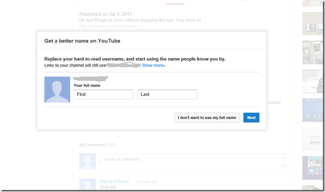
Since last year at least, Google has been big on pushing me to provide my stupid “real” name. Well I don’t want to provide you my full name Google. Real or fake. I just want to use my username that I’ve had for a long time, thank you very much. Get over it.

But nope. After so many refusals from me, they kind of give up for maybe a few weeks. But then try again right after that. I’m just commenting on a video and the stupid “Give-us-your-name” prompt comes up as I type a few letters, as shown in the picture above.

There’s no X to close, so I click “I don’t want to use my full name”. Then it comes with this prompt:

image

Uh… where is the option to exit out of the stupid thing? I only have four choices:

  1. Preview my name – Uh, no I don’t want to use a name, remember?
  2. Same name – Again, I don’t want to use any name…
  3. Different names – Do I need to repeat myself?
  4. Why is this important? – Well it isn’t important to me, so buzz off.

They keep claiming “Don’t want to use your name? More options are coming soon.” Yeah right. You’ve been saying that for a year. This isn’t a social network or an ordering site Google, it’s just a place I watch videos. I don’t know any other video service that pushes you to sign up for a name.

Either way, those 4 options are nothing I want and hitting refresh like twenty times doesn’t work. Do these count as page views? Seems like Google games their site views this way. After a long while, they’ll come up with a similar prompt, but I get a fifth option to not use my name. It’s ridiculous why that doesn’t show up first at the very beginning, but it’s Google hoping that people will get tired of refreshing and provide a name I guess. 

I finally relented and picked one of the dumb options today. I picked “Same name”. Sigh.

What are your thoughts on this? Leave some comments below.

What I’d love to see in the next Xbox

Although the Xbox reveal is coming today, I thought I’d share my thoughts to anyone that still happens to read this blog (despite my not finishing many drafts of things I’d love to talk about). I don’t have a super in-depth list, and it’s not very gamer-oriented as I’m far from a true gamer, but here are something things that I think the Xbox should ideally have that I believe would appeal to most people. Here we go, in no specific order:

  1. 4K Ultra HD output – 4K displays are still not common yet, as they’re very expensive, but it seems that in maybe 4-5 years, it will be more common place based on news I’ve read. This would definitely help future-proof the Xbox, and give it a boost over the PS4. Unfortunately, I think Microsoft will likely wait until the generation after to give a solid reason to upgrade and I guess it makes more sense to wait until more living room displays actually use it, since it seems they use a lot of power to render in 4D. It’d be great for gaming, and watching videos if Xbox supported it natively, or at least do decent upscaling/optimization.
  2. BluRay Drive – Optical media isn’t dead, and it’s always nice to have something that can work without the Internet. BluRay discs can of course store more information, thus lessening the need of multiple discs. It’d be nice to watch movies from too. The ability to read 100 GB BDXL would be a major bonus too.
  3. Upgrade Kinect tech – Ideally, Kinect can work in more confined spaces just as well, and hopefully better capabilities (or game developers) so that games can use it more ways than ever, and it’d be great if a AAA game can (optionally) be operated entirely through it.
  4. Competitive pricing – Microsoft made the smart decision with the 360 generation to give the console a lower than profitable price, and make the money back through (pricey)accessories, Xbox Live Gold subscriptions, and Marketplace content. Ideally a range of $200-$500 for any variation of console types would be awesome. The lowest range supporting the base needs to run games properly with maybe low built-in storage, and the high-end of course having everything.
  5. x86-64 architecture – It’s how PCs operate on, the PS4 will operate on, and hopefully the next Xbox. Having the same architecture should ideally make it easier to develop games, where games can be deployed faster, with less issues, and more time could be focused on improving the games. Would also make sense if it will truly have more cross-platform integration with Windows itself.
  6. Fuller integration with Windows – I’d like to see more games capable of cross-platform play with Windows PC users, easily hook up or stream content from your PC to your Xbox (either wirelessly or through a cord), and a true “buy once, play anywhere” that is not crippled by only working on certain platforms or only working on just one platform period. I’m also hoping to see SmartGlass be used further in games too.
  7. Improved hardware – Goes without saying of course. It’d be nice to avoid the Red Ring of Death issues that plagued the early generation of Xbox 360s. I’m hoping to see a low power standby state, and low noise output from the console.
  8. Reduction of Xbox Live Gold price – Now that there are more Xbox users than ever, perhaps it’s time Microsoft could lower the price of Xbox Live Gold. Now I no budget analyst, but I’d like to think that Microsoft can make more revenue by lowering the price of Gold across the board and see more people pay in.

What I don’t want to see:

  1. A radical new game controller – It seems like most people like the Xbox controller for it’s ergonomics and whatnot. The d-pad is it’s only weak point that should be fixed. Maybe a charging port with an internal battery, though I guess not everyone would be a fan of that idea. But please no mini-screen on the controller. I do not see it offering much significant utility, and it will only shorten the controller’s battery life and make it ridiculous to use if the screen ever gets damaged. The use of another screen should only be optional with SmartGlass.
  2. Avatars – I always thought avatars looked kind of dumb. Not Xbox specifically, but in general. The idea of interacting in a ‘3D’ world on your console seems kind of dumb, but maybe there just hasn’t been enough work towards it. Case in point: the proposed Avatar Arcade that never got off the ground. I don’t think it will make it to the new Xbox either. It also seems to deviate away from Microsoft’s Metro (or Modern) philosophy of keep things simple and minimalistic, and avoiding skeuomorphism. I know it’ll suck for people that already bought into decorating and accessorizing their Avatars, but we need to move on. Or at least design better looking ones. I wouldn’t mind a flat 2D version that looked much better.
  3. Always online for DRM verification – It seems these rumors are already scrapped but we’ll see. If the PS4 isn’t doing it (which it doesn’t seem), then neither should Xbox for sure. Game companies need to use better methods than always online to play, because it’s pretty obvious that Internet will never be a constant element that will always work. If I can’t play because some online company can’t verify me, then I’m going to find alternatives. EA’s recent SimCity game has had many issues relating to going that route.

So much for IE9’s tab recovery

IE9 claims to have tab recovery features yet in my personal experience, 9 times out of 10, the tab recovery feature does NOT work.

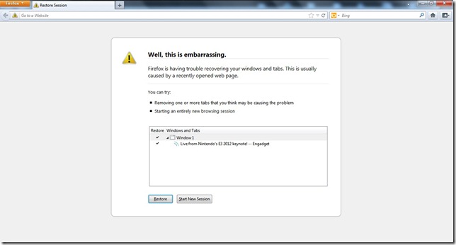
My HP Pavilion 363-2000 NR machine loves to conk out as soon as I move the laptop just slightly in the air while the screen is open if I move it too quick. Why? Because it’s crappy. It reboots up with a Windows Error Recovery screen and as soon I load back my desktop, I open IE9 to see this:

image

I see my Bing homepage all right. But I do not get the tab recovery I expect from IE9. That means I have to hunt for every site I had opened before and that’s pretty darn ridiculous to keep track of.

When I load up Firefox however, I get a much better result.

image

Firefox does a much better job as you can see.

I’m not certain if IE10 fixes the tab recovery problems, but if it doesn’t, I’d be pretty tempted to just switch browsers because this is ridiculous. I wouldn’t post about this if this wasn’t something I see super frequently.

UPDATE: Not only does IE9 fail to open up the prompt to show me everything I lost, but it doesn’t have ANY website history prior to the crash! The only history I have is my homepage, for the history in “Today”. I’m not sure how IE9 saves history, but the fact it can’t recall any of the sites I was on prior to the crash is super stupid.

Windows Phone still fails at retail–wholesale clubs

These are just observations I made myself, but it is really hard to find decent Windows Phones at retail, when it comes to wholesale clubs like Costco and Sam’s Club for example. Now not everybody buys their phones at wholesale clubs, and I could not find any studies or research that breaks down where consumers buy their phones, but I would guess wholesale clubs have some market penetration when it comes to mobile phone retail.

So Windows Phone 8, based on what I’ve read, is selling at a better rate than what Windows Phone 7 did (or at least it’s not losing as much market share) but it still has a way to go as far as market presence (at least the American one) goes. It doesn’t help when you have poor retail presence for sure.

Between the dashed lines are some reasons why I decided to go for a Windows Phone if you’re interested in checking out, or you can skip below the dashed lines to see the main point of this post.

——————————————————————————————

I am still one of those people that do not have a smartphone, but I am interested in one. I think nowadays, people do not only pick phones based on just hardware features, but also specific operating systems that they either prefer or would like to avoid for whatever reason.

I am definitely interested in getting a WP8 phone (super glad I didn’t go for a WP7 phone), but there seems to be a much limited choice to pick from than WP7 had, and even limited carrier options too. Although I like how thin HTC’s 8X and 8S are, and whatever features HTC has that’s unique for those phones, I am going to lean towards a Nokia based phone. Why? Nokia’s exclusive apps hooked me in. Nokia Transit is something that a carless person in Houston such as myself could definitely use when I’m on the go. No more having to worry about preloading transit directions from Bing Maps on my (often defective) laptop in a WiFi zone before going, wasting paper printing out transit directions, or having to call METRO and waiting for a few minutes to figure out bus times and such. Nokia Drive is useful when I’m in the car with my parents who don’t have smartphones or a standalone GPS unit and could use it sometimes to beat the traffic or find a spot on the go. Nokia was smart to make desirable exclusive apps as a way of differentiation.

——————————————————————————————-

So I want a new phone, and I came with my family (since I’m on a family plan) to go shopping so we can all take advantage of the expiration of our 2-year contract and upgrade our phones. Well, even though it expired since like fall 2012, but that’s another story.

My dad wants to go to Costco because he likes their no activation fees, how the prices are supposedly very good and even include nice accessories and other useful stuff that you supposedly can’t get elsewhere bundled with such a flat rate. I’m saying “supposedly” because I’m not certain if it’s true, but that’s what he based it on.

In America, we tend to be carrier tied whether it’s for exclusive phones, coverage, or pricing. Our family is a T-Mobile one. So we went to Costco to check out what T-Mobile had. I could see 6 phones laid out, 2-3 of them Androids, 1 HTC 8X (Windows Phone) and 2-3 of them being dumbphones. As I said before, although HTC’s WP8 phones are pretty great, I’m going with Nokia because of the exclusive apps.

The problem is, we’ve tried stopping a few times prior to this at Costco to see if they would have the latest Nokia phones for T-Mobile, but they never did. I did query about this to the sales rep a month ago and he showed me a display model of the Nokia 810 hidden under a shelf and said it’s not in stock yet, and no idea when they would. So I was hoping this time they actually would.

So as you can see, the 6 phones I see do not include Nokia, and I would expect every phone that’s available as an option to be displayed or indicated in some way. But nope. No Nokia.

I’m guessing the sales reps must either a) aren’t Nokia fans, b) they don’t get commission for Nokia phones, or c) their manager probably told them to not even make it visible. Why? Because:

  1. You have to specifically ask if the Nokia 810 is available. If you ask if there are other phones, they’ll be like “No.” but I’m guessing it’s hard to lie when you specify if they have a certain brand and model available, and they may get busted later for lying.
  2. The Nokia 810 display model is hidden behind the counter. Even though there’s room for 5 smartphones to be shown on the front display, 5 additional less visible compartments to hold dumbphones perhaps along behind the display. But when you have only 4 smartphones and 1 dumbphone on main display, plus 1 dumbphone and 4 empty spaces in the compartments, why can’t the Nokia phone at least be given a compartment space rather than be stuffed under the counter where no customer can see it? I think you know why…
  3. None in stock! – So typically, they’ll have phones available to purchase right away in the warehouse near the checkout lanes, but these Nokia phones are so special, you can only receive them in the mail in 2-3 days apparently rather than getting it in the store right away. Wonderful, right?
  4. No working models – To add insult to injury, neither the Nokia 810 or the HTC 8X for this matter are even working display models. So people can’t really try out the OS or see the special features themselves. But there is a working display model of an LG Optimus III they really want you to buy.

So when a customer can’t see a phone on display, there’s practically no mention about its existence as an option, it might as well not even exist when people are shopping.

At least Costco still offers the Lumia 900 for AT&T (that’s 900, NOT 920) and I think a Nokia 820 I believe for Verizon. But the 900 is still a good cheaper phone, if you ignore that it can’t be upgraded to WP8. I’m being serious about that being a decent deal if you don’t care for new apps/features for about 2 years.

Costco does have a fairly decent deal on the Nokia 810, where it costs around $129 with a 2-year contract, where I’d typically see it for $149 with a 2-year contract instead. Plus it comes bundled with nice accessories in a convenient package.

Costco is much better in at least offering Windows Phone than Sam’s Club. I thought Costco was kinda bad about this, but Sam’s Club was worse.

I went to a Sam’s Club across the freeway and they offered NO Windows Phones. Period.

Instead, they had a collection of dumbphones and what I thought were crappy Android phones and I think a BlackBerry or two. But most of the attention is focused on the iPhone 5 or iPhone 4S on AT&T. It’s displayed closest to a main aisle of the store, looks much better displayed than the other phones, and you get the picture. Oh, plus there’s a nice iPhone poster suspended from the ceiling rafters of the warehouse right over the mobile phone kiosk. I’m surprised there’s not a spotlight shining over it also.

I asked the guy if there were any Nokia phones and he grunts a “No.” Well I guess that’s a no-sale. Worse, my dad wants to ask some questions about upgrading and stuff but the rep disappears for at least 5-6 minutes and wasn’t at all helpful with questions when he came back. I guess if you’re not interested in the golden iPhone, you’re nothing.

I checked out the tablets on display instead (with a wonderful iPad poster suspended from the rafters over the entire display area, and I checked out the Nexus tablet and an ASUS Windows RT tablet. The Nexus seemed cool, but not being a big Google user, wasn’t too interested in all the Google stuff it had.

The ASUS Windows RT tablet was a mess when I wanted to see it. First of all, it wouldn’t even turn on because the unit wasn’t even being charged. I found out the charging USB cable was dangling under the table (it’s a wire-meshed type so there’s holes big enough for it to drop through) so I had to pull it out and connect it. Then I had to fiddle around the device to find the power button and finally got it to boot up.

Then came the stupid password lock. Seriously. Why the heck are these devices password locked? How can customers explore if they don’t know the freaking password because a) the idiots in this department really like making certain products a hassle to look at or b) it’s so hard to write a quick password that anyone could read if they’d put it on the display just-in-case so we don’t have to flag the disappearing sales rep.

After chasing down the sales rep to unlock it, I could finally look at it. It was neat, but I was already pretty steamed at them offering zero decent smartphones, the obvious blatant Apple love and preference Sam’s Club has, and offering another possible reason why maybe Windows 8 isn’t selling as well (regardless if you like it or hate it). Needless to say, I don’t think I’m going back to Sam’s Club to purchase any non-Apple products anytime soon.

So after my two experiences at this store, I really think Microsoft should contribute some potential lost Windows Phone 8 sales because of these wholesale clubs not taking Microsoft seriously as far as smartphones go. With near zero visibility or even availability in warehouses, all those customers shopping there are likely going to buy other phones.

I wouldn’t call myself a Windows Phone or Microsoft fanboy for calling this to attention, but as someone that does like Microsoft products and would like to see MS gain some traction in the market, stuff like this irks me because it’s totally meant to shift people away from MS at least. Microsoft can make lots of ads if they’d like, but with little visible retail presence, it’s hard to get interested people to still keep that interest when local retailers like to pretend MS doesn’t exist.

Perhaps Microsoft having their own first party retail stores was a good idea because it seems that these 3rd party stores are either only interested in helping Apple or Google and that’s that.

If only IE could recover webpages after a computer crash

Sometimes my terrible HP 2000-363NR will have a system crash if I jerk the computer too fast in the process of moving it somewhere else. I usually use both Internet Explorer 9 and Firefox 11.0.

When I restart my system, I notice Firefox consistently manages to remember what tabs I had before the system crashed and presents it to me and lets me even pick which tabs I would like to reload instead of just loading them all.

firefox crash

IE9 on the other hand acts like I didn’t have any active tabs before the crash. I load IE9 after the crash, and it just goes to my homepage. Once in a blue moon, it will show some kind of prompt with something like: “Your browsing session appears to have crashed. Recover webpages? [Yes] or [No].” There’s no choice to load particular tabs or windows, and it won’t work for pinned IE9 sites. Plus this behavior isn’t consistent; 9 times out of 10 I get no chance to recover webpages.

So the IE team, please get a clue and have Internet Explorer consistently pick up wherever you left off, regardless of a system crash. If there is a crash, I should be able to either restore all tabs/windows, or selectively checkmark on a list the tabs/windows I’d like to restore. Thanks!

Will the Start Screen be Windows Gadgets all over again?

Remember when Windows Gadgets were introduced in Windows Vista? It was supposed to be the cool little widget engine for Windows that was meant to compete with the likes of the OS X Dashboard or Yahoo!’s Konfabulator. However, it rarely got any good major third party apps. In fact, the only good ones were primarily the ones that were built-in or developed by Microsoft. It was a major disappointment, but it also tended to chug on resources when not in view and it just never provided the functionality the most people cared for.

So will the new Start Screen suffer the same fate? After all, the Live Tiles are very similar to gadgets, and the Metro applications are much like widgets in fullscreen. Though given how you can’t ignore it, it might be something that Windows 8 users will grow used to or some ammunition for others to finally make the switch to a Mac.

windows-8-Start-Menu-Programs-menu

The big thing is the Metro design language. I love it the way it looks and works in some places (Zunes, Xbox dashboard, WP7) but sometimes it can be pretty bad (Microsoft.com website and perhaps Windows 8). Even on many pro-Microsoft sites, a lot of people are commenting their strong dislike with the way Microsoft did it.

I can somewhat agree that Microsoft didn’t do such a hot job with Metro in Windows 8. Here are some reasons I believe the Metro Start Screen might become a fail:

1. Inconsistency with WP7 tiles – The tiles are similar to Windows Phone 7, but they’re not exactly consistent in both colors and icon style. In WP7, you get to choose a default color theme, like red or blue or whatever. In Wind0ws 8, the color theme only appears for the background and may charm bar icons. All the built-in apps have completely different colors. Then the Music and Video tiles have icons that don’t appear to exist in WP7 tiles. Whole point of tiles on Win8 was unified consistency with other products, right? Microsoft, please be more consistent with the way icons and color theme options work for the tiles.

 2. Too many tiles – On Windows Phone 7, the Live Tiles or static tiles are nice and handy on a smaller screen. But on a desktop or laptop screen, so many tiles can be a bit more overwhelming. Sure, they can be somewhat grouped and such, but it can seem like a lot somehow. The ability to organize into folders or virtual folders would be useful. Also, why not make use of vertical scrolling? Maybe for hubs of tiles or something?

3. No hubs? – WP7 had ‘hubs’, you know, the area where related apps/shortcuts/content are all in one place? Yet Windows 8 appears to lack a Games hub, Office hub, Music + Videos, and a People hub. Everything is a separate tile with a separate interface. There’s no synergy for the most part. The photo app only allows some Facebook, SkyDrive and Flickr stuff. There really needs to be an emphasis on similar ‘hubs’ and more integration if Microsoft wants to connect the experiences across all products. Also, I would suggest that hubs are stacked in a vertical list, and tiles/content associated with a hub appear in a horizontal list. Use of scroll wheel could be used as a ‘semantic zoom’ and arrow keys or . What I’m described would look a lot like Windows Media Center without the gloss. Or maybe a horizontal list that splits up the hubs into tiers at the top similar to the Zune desktop software (like the top row will have the major hubs: Home, Games, Media, etc. and a row below that shows sections of the hub, like for Media, there’d be Music, Videos, Podcasts, etc.)

start screen

4. “Start” at the very top – The word appears at the very top and seems to be rather useless. It’s pretty obvious that’s the new Start menu/screen, and if it’s meant to be an official way for novice users to identify this part of the interface, I’m quite sure there are other more practical ways of doing so. Please get rid of the “Start” word at the top and if must be replaced with something, make it feel like it fits better.

5. Design is too flat and staleAdding some drop shadows would really help give some depth to the tiles so it doesn’t feel like they’re stuck to the background and it looks nicer. Even a really small gradient could make the tiles more easier on the eyes, so you don’t have to shift from one solid color right into another one. The latest Xbox dashboard can have such shadows and some gradients why not Windows 8?

6. Lack of major apps – There’s a very small amount of ‘official’ apps from big-name companies that are available at the moment. Most of those apps are hardly noteworthy and barely do much. If Microsoft can’t get major companies on board, there will likely be few independent apps that will of high quality. People want to be able to access their favorite services, games, and such from the brands they trust most.

7. Needs more ‘contracts’  – There’s a limited amount of Contracts currently. If Microsoft could get more picker, search, and sharing contracts, it’d really help give some credence that the Start Screen can be very useful.

8. Apps might be too dumbed-down – On a smartphone, it might be somewhat acceptable, but we’re talking about a desktop environment. The Metro apps need to do a good job of balancing the needs of users with the simplicity that Metro aims for. I’m quite sure if developers try hard enough, they can give achieve both form and functionality.

I still have mixed feelings about the Start Screen. I hope that more customization, real use of hubs, making Metro more lovable, and getting major third-party developers involved will be key to whether the new Start Screen will be a hit or miss for Windows. Unlike the Windows Gadgets, the Start Screen isn’t something most people will be able to ignore unless they find some third-party solution, and it might make users love Windows more or push them to get a Mac. Hopefully, Microsoft will have it down by the time it’s finally released.

Microsoft Academic Search replaces Bing Academic

I just stumbled upon this recently while searching grants, but Microsoft has a ‘new’ replacement for Bing Academic. Well maybe it’s not so new, at least as of August 2011. No blogs that I follow (like LiveSide) seem to have picked up on it though, so I think it’s worth a mention. It’s called Microsoft Academic Search (Beta).

image

Anyhow, it essentially does what Bing Academic did, and competes with Google Scholar. It’s currently in beta, but from my initial experience, it’s very nice to use and it kind of has the Bing style, but better to use and better looking. I wonder if/when they will integrate this with Bing.

As of right now, you can explore 38,835,103 publications, 19,159,670 authors, and 2,250 were updated last week. There’s a domain list of fifteen:

  • Agriculture Science
  • Arts & Humanities
  • Biology
  • Chemistry
  • Computer Science
  • Economics and Business
  • Engineering
  • Environmental Sciences
  • Geosciences
  • Material Science
  • Mathematics
  • Medicine
  • Physics
  • Social Science

There’s special Visualization Features including:

  • Academic Map – Navigate geographically through organizations and authors in a specified domain
  • Organization Comparison – Juxtapose two organizations and compare their citation counts, keywords, top authors, and more.
  • Genealogy Graph – Display the advisor and advisee relationships of a particular researcher.
  • CFP Calendar – Search for conferences you may be interested in by domain, time and location.
  • Co-author graph – Display which researchers have the most collaboration with a particular author.
  • Paper Citation Graph – Discover which publications have cited a particular publication.
  • Domain Trend – Visualize the research trends in computer science through an interactive stacked area chart.
  • Co-author Path – Display how two researchers are connected via their co-authors.

There’s even a Windows Phone client. Here are some various screenshots of Microsoft Academic Search:

image

image

image

image

image

image

image

image

image

Things to note after my quick glance:

  1. Mapping uses a combo of Bing Maps and Silverlight (can take a while to load)
  2. There was a glitch with the Organization Comparison; It would try to compare Yahoo Research Labs with whatever I had entered in on the opposing side. For a few searches.
  3. Checking out the Genaology Graph requires you to accept the terms, mainly because they say it might not be accurate or whatever.
  4. The Academic Map doesn’t have a legend. All the dots have varying sizes and colors so not sure if that means anything.

I’m not really an academic researcher at this point, but I could see myself using it and liking it. I’m really happy that Microsoft has created something like this, but they haven’t really pushed it out there. I wouldn’t have found it if I hadn’t just hit one of their search results link through Bing while finding grants. What do y’all think of Microsoft Academic Search?